Context
Built to make managing subscriptions feel effortless — across web and iOS.
INXY.com was designed as a smart platform that helps users track, analyze, and manage all their recurring payments — both personal and business-related — from one place.
The Merchant Portal became the core workspace of that experience — a powerful web platform (with an iOS version) where users could see all transactions, connect bank accounts, view analytics, and receive alerts about upcoming charges.
My role focused on building a consistent, data-driven UX across platforms — ensuring every flow felt clear, predictable, and trustworthy.

Problem
As the platform expanded, users started losing orientation in its growing functionality:
✦ It wasn’t clear where to find payment analytics or cancel a subscription.
✦ Adding bank accounts felt risky and confusing, creating friction and trust drop-offs.
✦ The interface became inconsistent — analytics, subscriptions, and notifications looked and behaved differently.
These issues affected both usability and user confidence — especially when dealing with financial data.
The goals were clear:
✦ Simplify navigation and hierarchy.
✦ Reinforce user trust during financial onboarding.
✦ Create a unified experience across Web and iOS, balancing data density with intuitive clarity.
Approach
I began by mapping the complete user journey — from the first account setup to recurring payment control. With over 20 interconnected modules (onboarding, dashboards, subscription lists, Plaid integration, notifications, settings, etc.), the main challenge was to make the platform feel human, not technical — clear, consistent, and trustworthy.
Focus areas:
✦ Simplify data-dense screens through clear hierarchy and a single visual language.
✦ Maintain functional parity between web and mobile, while optimizing interaction logic for each platform.
✦ Reinforce trust and transparency during every financial touchpoint — from copy tone to micro-animations.
✦ Build a component-driven system connecting both platforms visually and behaviorally for faster iteration.
Solution
The redesigned portal introduced a new information architecture and visual framework that unified the entire product experience.
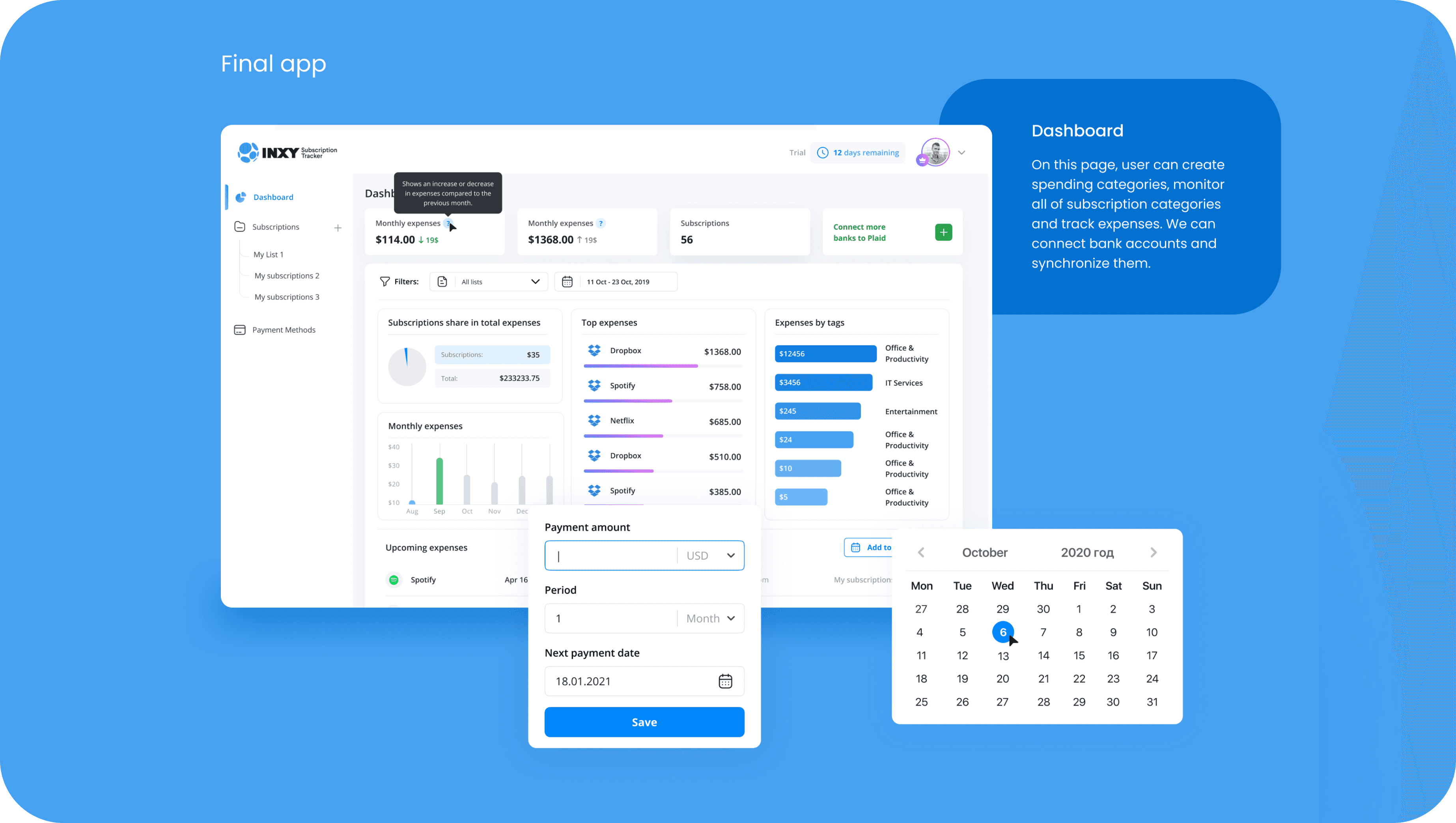
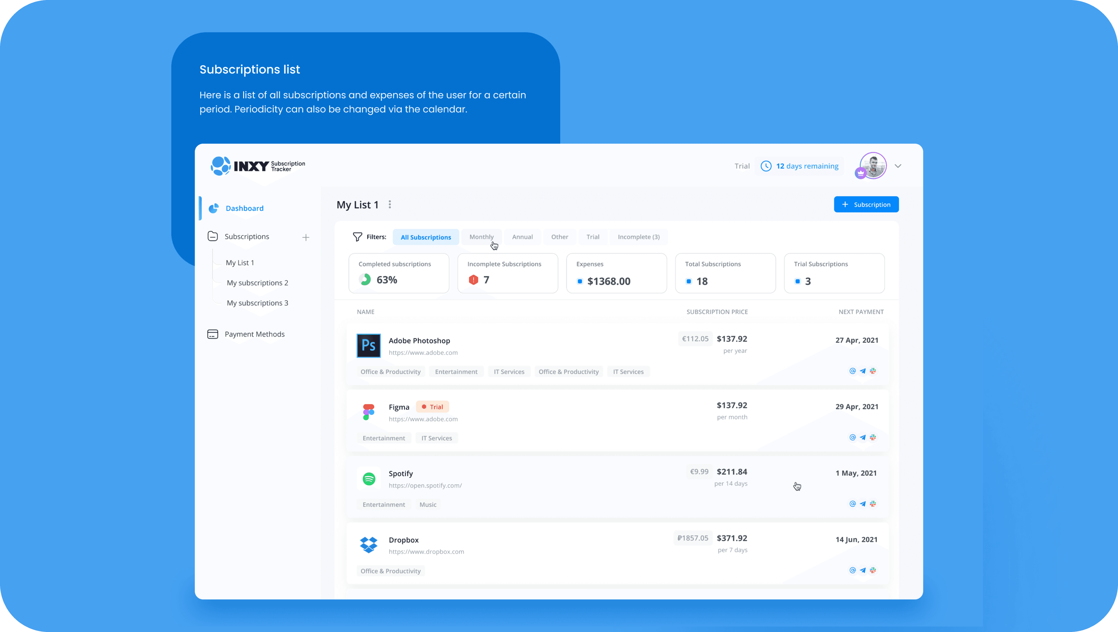
✦ Unified Dashboard — gave users a clear snapshot of their expenses, income, and active subscriptions at a glance.
✦ Smart Categorization — automatically grouped transactions by context (Entertainment, Office Tools, IT Services, etc.), helping users spot spending patterns faster.
✦ Cross-platform Consistency — harmonized layouts and interaction patterns across Web and iOS, reducing learning curve and UI fragmentation.
✦ Secure Bank Connection Flow — built a transparent, step-by-step onboarding via Plaid to reinforce user trust during financial linking.
✦ State Management System — standardized logic for empty states, hints, and notifications to minimize confusion and cognitive load.
✦ Visual Language Redesign — introduced a modular, scalable UI system for long-term growth and performance.

Outcome
INXY’s portal evolved into a cross-platform financial assistant — not just another dashboard. The new experience made recurring payments transparent, manageable, and even pleasant to track.
By aligning structure, trust, and consistency across Web and iOS, I built a system that feels cohesive and human — whether you’re checking analytics at your desk or managing subscriptions on the go.
“The best financial UX doesn’t overwhelm you with data — it quietly guides you through it.”