Setting the Stage
Creating a reliable workspace for merchants in a complex crypto world.
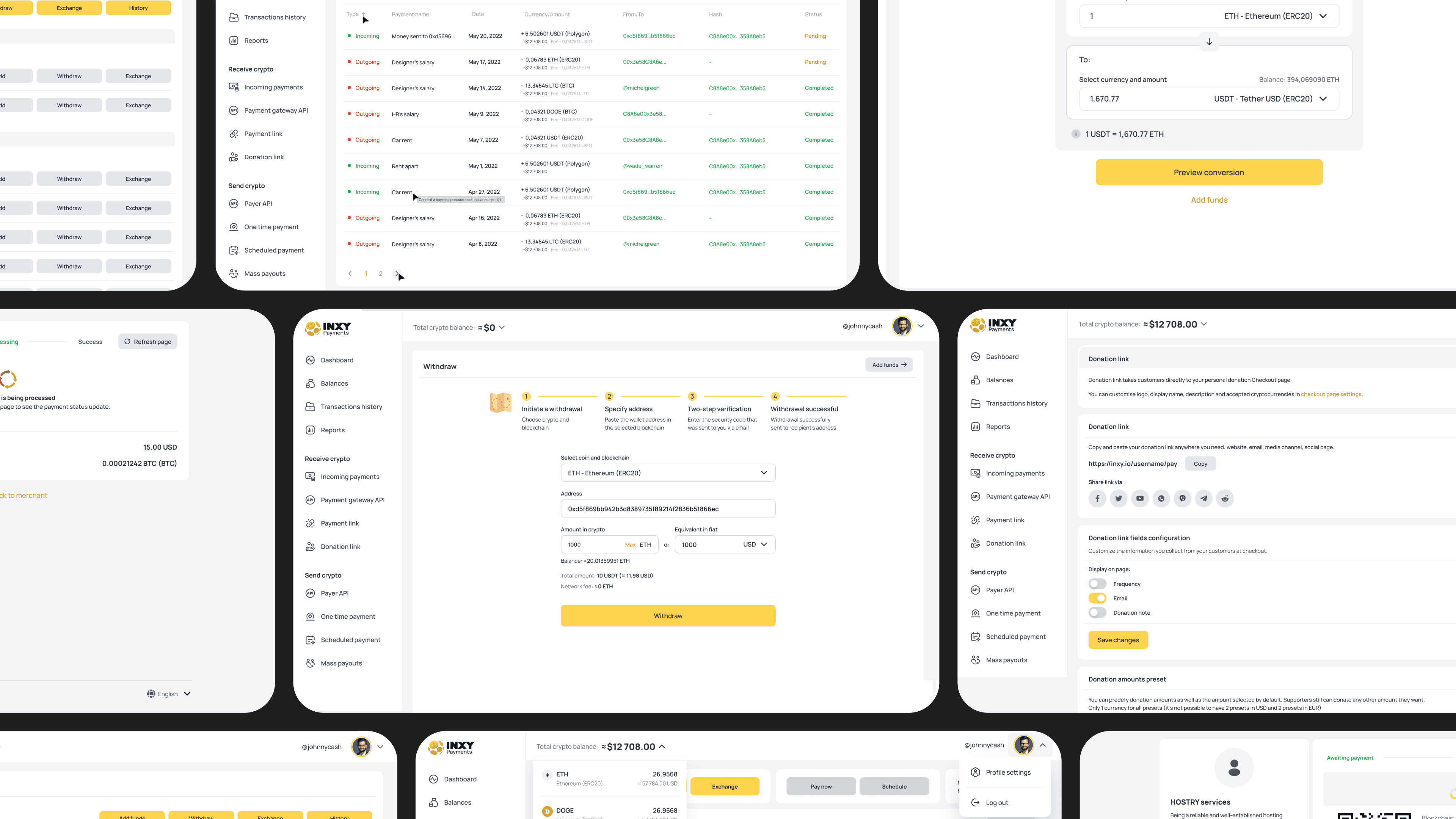
While the Payment Flow focused on user trust and conversion, the Merchant Platform was built in parallel — as the foundation keeping the entire INXY ecosystem running. It wasn’t just a dashboard; it was the control center for every merchant — a place to manage transactions, track balances, issue refunds, create payment links, and stay compliant with crypto regulations.
The goal was to make crypto management feel simple and human — to give businesses the same confidence they offered their customers, now powered by structure, automation, and clarity.

Finding a Starting Point
Before INXY.io became a product, it was just an idea — and a question.
Our CEO came to me and the CPO with a simple question:
“How could a crypto platform for businesses actually work?”
The goal sounded ambitious — a single workspace where merchants could create payment links, process crypto transactions, manage subscriptions, and send mass payouts. But at that moment, it was just an idea and a few business notes on paper.
We decided to start lean, focusing on three core sections — Dashboard, Transactions, and Payment Links — to define the product logic and validate assumptions. Once the direction felt right, we brought in analytics, backend, and business leads to scale it into a full roadmap.
To prioritize what really mattered, we focused on:
✦ Distinguishing urgent merchant needs from “nice-to-have” business ideas.
✦ Balancing ambition with limited resources — building lean, but laying solid foundations.
✦ Researching crypto-specific pitfalls to prevent security and UX blind spots early.
✦ Iterating fast and validating often — every week brought new data and insights from real users.
The Merchant Platform quickly became our biggest design challenge — building a complex financial system from scratch, with no playbook to follow.

Goals
When we started defining the Merchant Platform, the goal looked simple on paper — to create a powerful yet approachable workspace for businesses dealing with crypto.
But turning that into a real product meant solving several challenges at once:
✦ Building trust in a system that operates in a space many still find intimidating.
✦ Creating a dashboard that feels structured and familiar — despite crypto’s inherent complexity.
✦ Designing flexible flows that support subscriptions, payouts, and integrations without breaking.
✦ Making it all scalable for both small merchants and enterprise clients.
We wanted the platform to act as a bridge between the crypto world and real business operations — something professional, compliant, and genuinely usable.
Process
Building the product from scratch required balancing research, structure, and iteration. We moved from broad exploration to tangible solutions — gradually shaping principles and testing them in real use.
We began with user flows and black-and-white wireframes — mapping out the first screens to understand how merchants would navigate the platform.

At this stage, there was no design system yet — every element was born from scratch, later forming the base for reusable patterns in both design and code.

Inputs
We had little data to start with, so the first step was to build context ourselves. We analyzed competitors, explored the crypto market, and talked to potential users to learn what would actually help them — not just look innovative on paper.
At the same time, the team was learning the crypto world inside out: architecture, compliance, risks, and bottlenecks.
That mix of exploration and chaos helped us define what’s truly safe, scalable, and realistic.

Principles
Before moving to detailed UI explorations, we needed shared rules to guide both design and development.
We turned early insights into a set of principles — a framework defining how the platform should feel and behave, not just how it should look.
These principles kept the team aligned as the product grew — from dashboards to payment links and APIs. They became a bridge between product vision and design system foundations.
✦ Simplicity: crypto payments should feel intuitive even for someone completely new to the field.
✦ Transparency: every action, fee, and transaction status should be clear at a glance.
✦ Consistency: UX patterns and code components should evolve together.

Explorations
Once the principles were set, we tested them relentlessly — in real builds, not in theory.
Whenever there was uncertainty, we tested. Prototypes were shared across the team, and everyone — not just QA — tested new features through live staging builds.
Even payroll was processed through our own platform. That mindset made testing personal: if you design or code something that pays your salary, you make sure it works flawlessly.
Making Decisions
Having clear principles early helped us make faster and more grounded decisions. When multiple directions looked equally promising, we used our principles as a filter — asking “does it make things simpler, safer, clearer?”.
✦ When choosing dashboard layouts, we discarded overly complex widgets because they conflicted with the simplicity principle.
✦ For payment flows, we prioritized clarity and error prevention over flashy visuals.
✦ For visual consistency, we avoided bespoke UI patterns that would break scalability across the platform.
This approach saved countless design hours — we stopped debating “what looks better” and focused on what actually worked for users and the business.
Result
The Merchant Platform became the core workspace for crypto merchants — finally uniting payments, balances, reports, and payouts in one place.
Here’s what changed after the launch — for both users and the business:
For users:
✦ Fewer failed or abandoned payments. Clearer structure and feedback reduced drop-offs and payment errors by 60–65%.
✦ Simplified onboarding and setup. Creating a first payment link went from 8+ minutes down to under 3 minutes.
✦ Better visibility and control. Users could now track statuses, refunds, and payouts without contacting support.
✦ Consistent navigation. All flows — from subscriptions to mass payouts — followed one clear logic.
For the business:
✦ Support load dropped by ~40%. Fewer tickets about payment confusion freed up time for high-value clients.
✦ Higher merchant retention. Businesses that previously churned in the first month started staying — and growing their volumes.
✦ Design and dev speed improved. The new component system cut delivery time for new features by 30–40%, with fewer bugs and less QA overhead.
What started as an empty shell became a living platform for real businesses. And the best signal it worked — merchants stopped asking “How do I do this?” and started asking “When can I integrate more?”
The platform became not just a tool, but a foundation for growth.
Learning
After launch, we took a step back to reflect on what actually built trust — not just what looked good in Figma.
✦ Clarity beats complexity. It’s tempting to show everything — blockchains, networks, gas fees — but trust grows only when the experience feels simple and human.
✦ Alignment saves weeks. Early syncs between design, dev, and compliance helped us avoid rework and launch faster with fewer surprises.
✦ Analytics > assumptions. Every test and Hotjar session paid off — the data often proved our “obvious” ideas wrong, and that was exactly the point.
✦ Speed is a design constraint. With limited people and time, learning to prioritize and iterate fast was the only way to keep momentum.
✦ Crypto doesn’t need to feel “crypto.” The less users had to think about blockchain, the more confident they felt using it.
Designing in fintech isn’t about pixels or UI polish — it’s about psychology, trust, and the quiet confidence that real money won’t just work, but feel safe.
Summary
In the end, the Merchant Platform became more than just a dashboard — it turned into the backbone of INXY’s crypto ecosystem.
What started as a few rough wireframes evolved into a full-scale product merchants rely on every day.
It proved that even in crypto, trust is something you can design — one clear flow, one confident user, one successful transaction at a time.