Overview
Within the broader INXY.io platform, the Payment Flow became the core experience — the moment users decided whether they could trust both crypto and the merchant they were paying.
Our goal was to make crypto payments feel as effortless and safe as any traditional checkout — transparent, predictable, and human. Instead of teaching users how blockchain works, we focused on designing clarity: clear states, reassuring feedback, and a flow that quietly builds confidence with every step.
Context
The first version of INXY’s payment flow was built fast — a lean release designed to validate the core payment mechanics and user behavior.
It worked technically, but as soon as real customers started using it for payments, it became clear where the flow fell short.
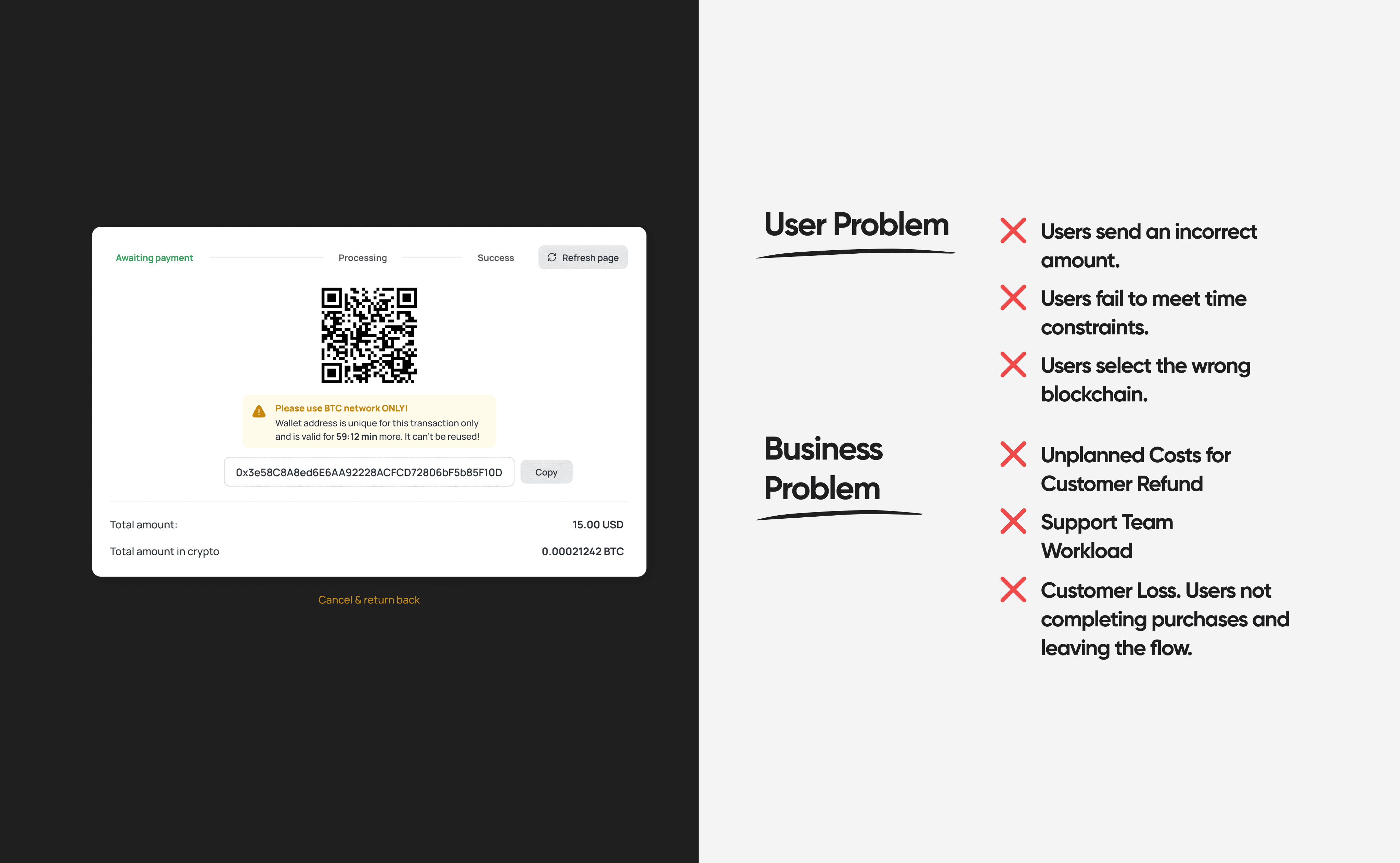
Conversion rates dropped sharply — around 80% of users abandoned the process midway, with support tickets and merchant feedback echoing the same issue: uncertainty. People weren’t afraid of crypto itself — they were unsure if their money would reach the merchant.
That early version gave us the data we needed. We analyzed analytics, heatmaps, and behavior tracking, followed by user interviews and A/B testing.
What emerged was a clear insight: users didn’t need more blockchain explanations — they needed trust through UX clarity.
Problem
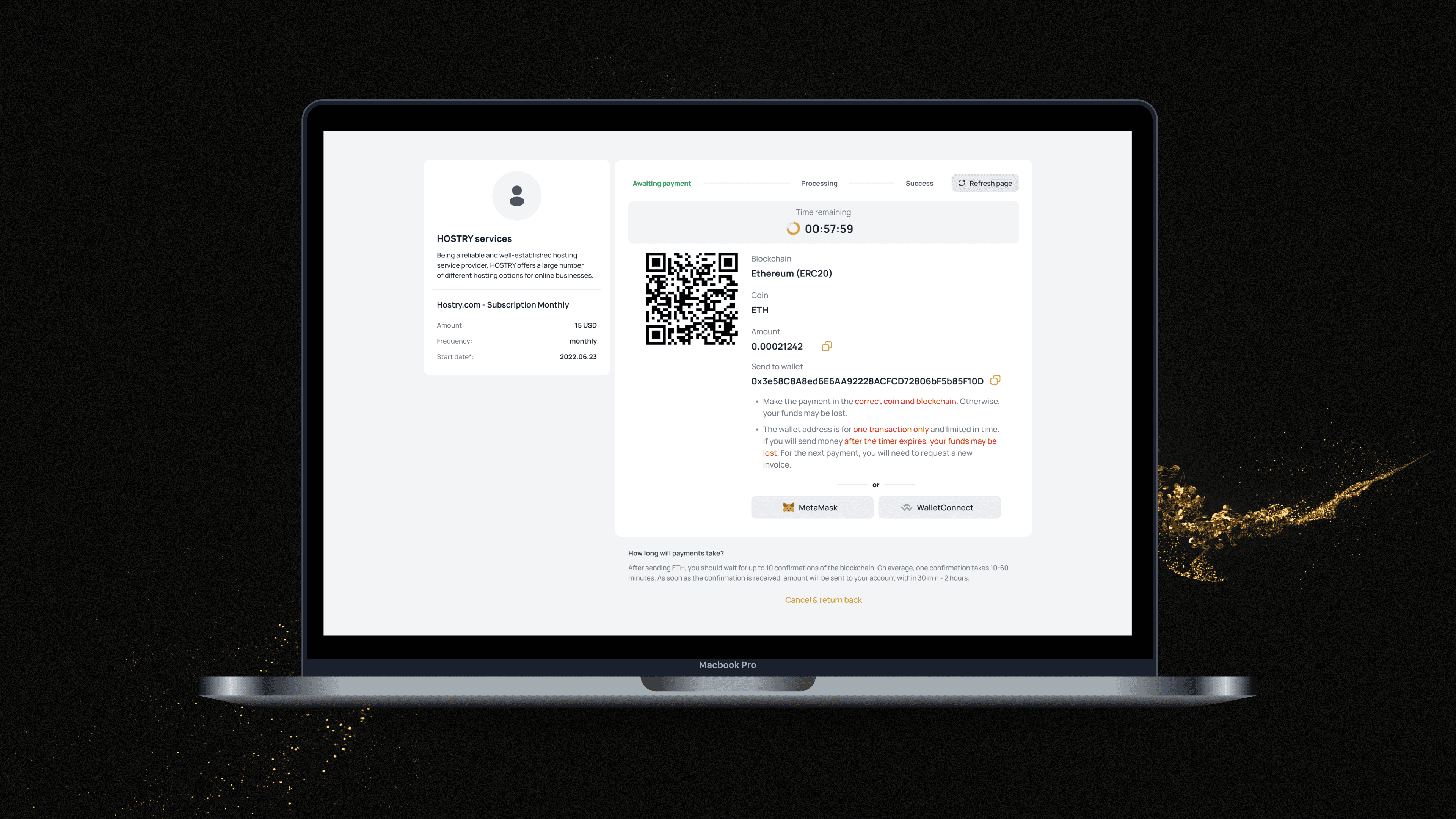
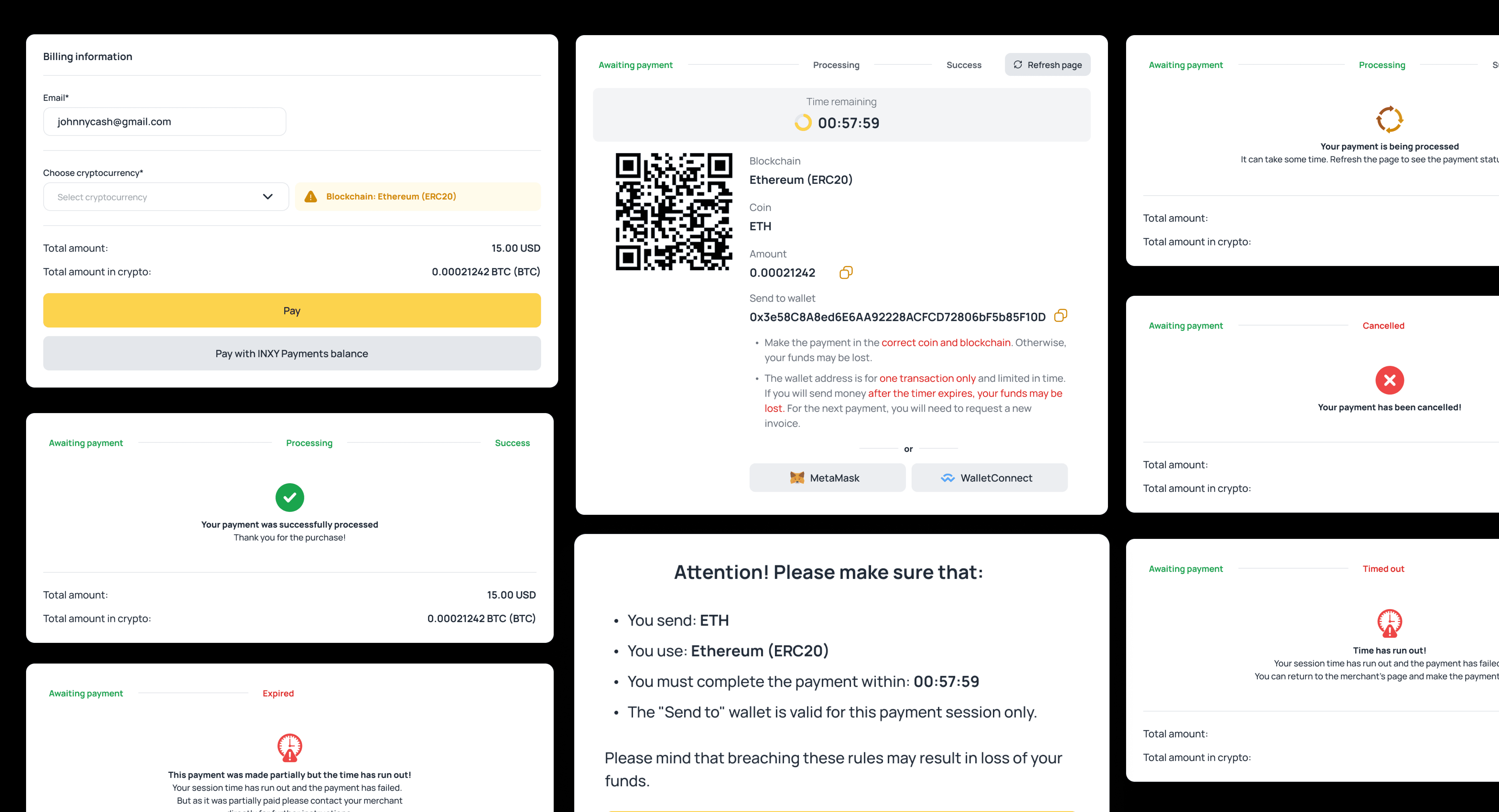
When the first version of the payment flow launched, it was designed to be simple — and it ended up being too simple. Many users got lost in the process and left before completing their payments.
During testing and after launch, it became clear users didn’t always understand:
✦ which blockchain or address to use,
✦ how long they had to send the funds,
✦ or whether the transaction had actually gone through.
As a result, the team was flooded with support tickets and refund requests. Merchants had to guide customers manually through each payment — otherwise, users simply dropped off.
Analytics confirmed the issue: conversion rates were low, and the steepest drop-off happened right before the payment confirmation step — the moment of trust.
Later interviews helped uncover the real cause: users didn’t need more instructions about crypto. They didn’t need more instructions about crypto — they needed clarity and feedback to feel in control and trust the process.
Process
Once the key trust issues became clear, we moved from observation to action. Insights from user interviews and heatmaps shaped the foundation for our redesign. I mapped hesitation points into proto-personas and user journeys to visualize how different user types — from crypto-native to cautious — experienced the flow.
Then we ran a focused workshop with the team to decide what stays, what goes, and what needs rethinking. We used benchmarking to compare successful and failed patterns across crypto payment platforms, identifying what actually builds confidence.
Research & Testing
Understanding hesitation and testing our way to clarity.
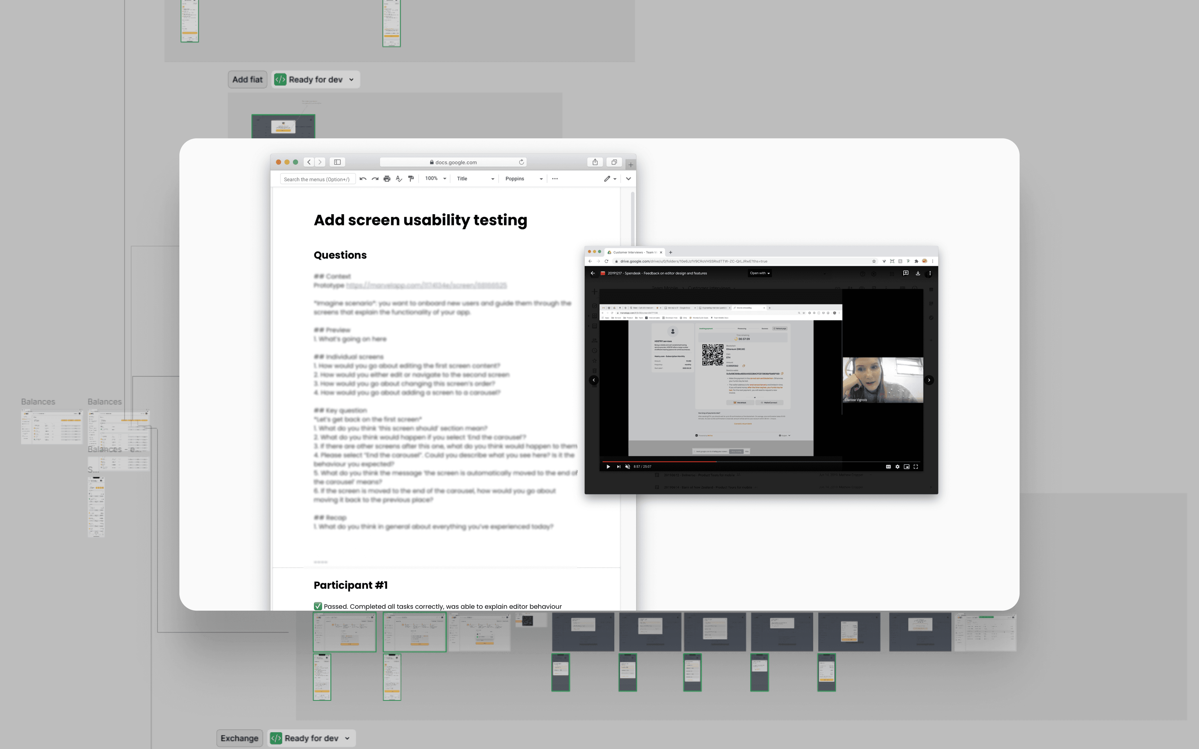
Before locking the final flow, we ran a series of fast, iterative tests — from Figma prototypes to live user sessions via Telegram and Google Meet. We reviewed Hotjar recordings and GA data, matched it with feedback from support tickets, and mapped where users dropped off or hesitated.
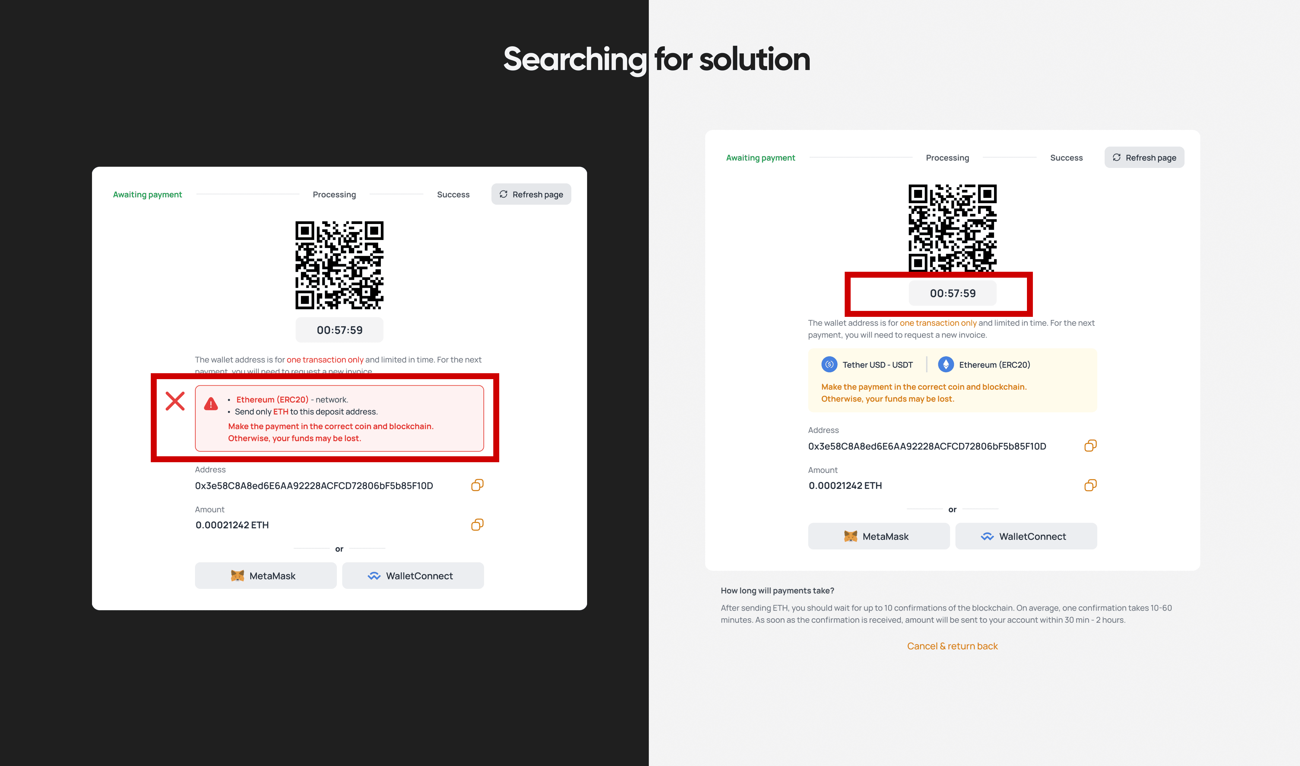
The results were eye-opening. Even red warnings went unnoticed. Users struggled with shortened or unfamiliar currency names, and they often confused the network with the coin itself.
When we separated coin and blockchain fields visually, completion rates went up immediately. Placing the timer at the top of the page also reduced failed transactions — users simply understood how much time they had.
Each iteration took just a few days — prototype, test, adjust, repeat.
We compared completion rates and behavior across versions, letting both analytics and user interviews guide every decision.
We kept iterating and comparing. After several rounds of refinement, errors on this screen decreased by 60–65%, and the number of support tickets related to failed transactions dropped noticeably.
The goal wasn’t to teach people crypto — it was to design calmness and clarity into every step of the flow.
Result
Turning hesitation into trust — and complexity into clarity.
The impact was immediate: hesitation dropped, confidence grew.
Users now moved through the payment flow with ease, no longer second-guessing each step or wondering if their funds would reach the merchant.
Each change — from separating coin and network fields to repositioning the timer — quietly guided users through the process
and restored confidence at every point.
Compared to the initial release:
✦ + 30% conversion rate on payment completion
✦ − 65% errors on transaction screens
✦ − 70% support tickets related to payment issues
✦ Noticeable growth in merchant transactions and positive feedback
Merchants stopped reporting “Did my money go through?” tickets altogether. What once caused frustration became one of the smoothest, most trusted experiences in the product.
The redesign didn’t just improve usability — it reshaped how users felt about crypto payments. The flow stopped feeling technical and started feeling human, predictable, and safe.
Learning
Beyond metrics, the project changed how we think about designing for trust.
Trust isn’t built with words — it’s built with logic and structure.
No reassurance text can replace a clear hierarchy and consistent flow.
Once users understood where to look and what to expect, the fear of losing funds disappeared almost instantly.
Startup speed doesn’t mean skipping research. Even with a small team and tight deadlines, testing and analytics paid off. Fast iterations with real users helped us move smarter, not just faster.
Design is only as strong as alignment. Bringing engineers, analytics, and support into the process early shaped the right priorities — and prevented “Figma illusions” that broke in production.
Analytics is a mirror, not an afterthought. Watching Hotjar sessions and pairing them with GA and support feedback revealed insights that no single research method could show on its own.
UX in crypto is mostly psychology. The less users feel like they’re dealing with crypto, the more likely they are to complete a transaction.
Clarity and predictability aren’t just design values — they’re the best trust builders.
This project became the foundation for how INXY approaches every financial interaction — clarity first, blockchain second.