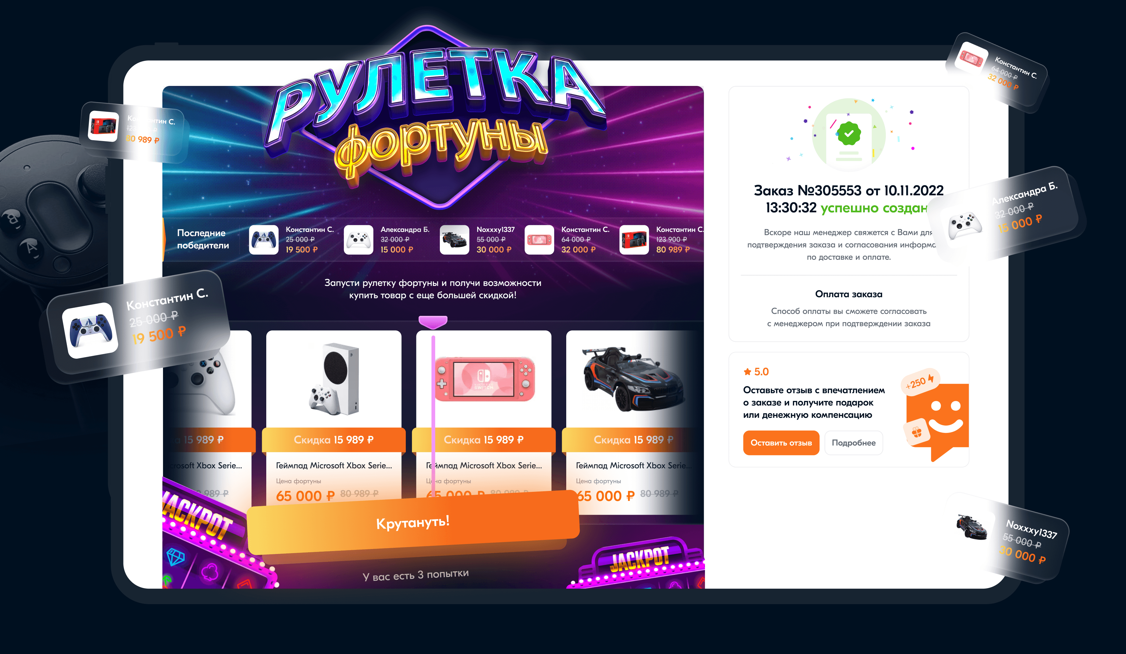
Marketing Banners & Brand Visuals
The marketing team at IgroRay needed a large volume of promotional materials for seasonal campaigns, sales, and collaborations.
As part of the design team, I helped develop a cohesive visual direction — creating core layouts, art direction guidelines, and key visuals that shaped the final look of over 60 banners produced during the campaign period.
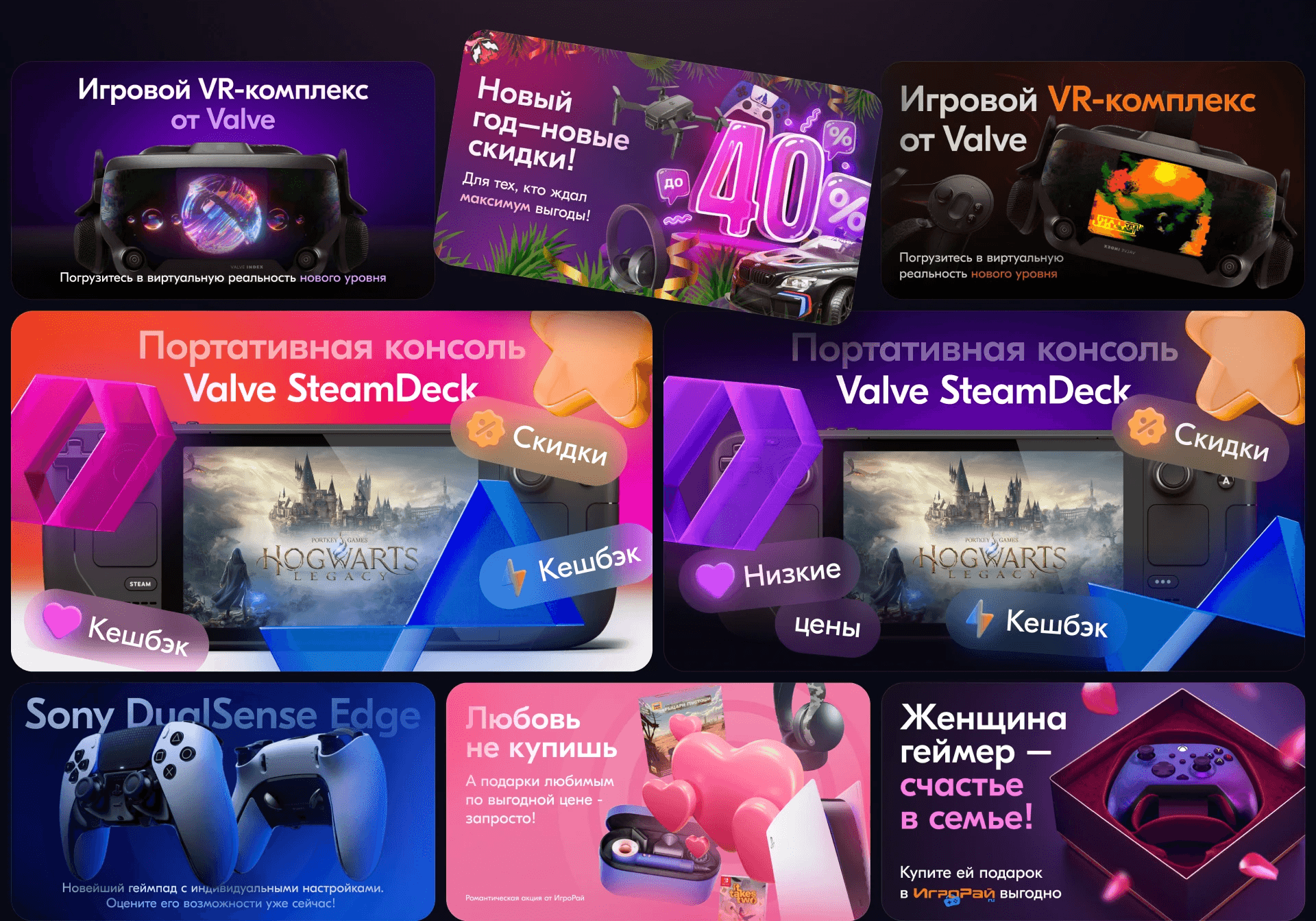
The challenge was to deliver a huge number of visuals quickly while maintaining a consistent and high-quality brand style across multiple campaigns and designers.
We built a system where every banner carried the recognizable IgroRay feel:
✦ Vibrant gradients & layered depth — to emphasize product focus and motion.
✦ Dynamic gaming aesthetics — inspired by neon lighting and game UIs.
✦ Scalable composition framework — for different formats, ratios, and devices.

The result was a cohesive and energetic brand visual language, improving campaign performance metrics and strengthening IgroRay’s market identity as a modern gaming retailer.
“By the end, the entire marketing space spoke the same visual language — bold, bright, unmistakably IgroRay.”

“The goal was to make every banner feel like a mini-game — dynamic, playful, and unmistakably IgroRay.”