Context
Prodamus is a fintech platform that helps businesses accept payments online — from Russia and abroad.
As the company grew, so did the needs of its merchants: more products, subscriptions, analytics, and payment links.
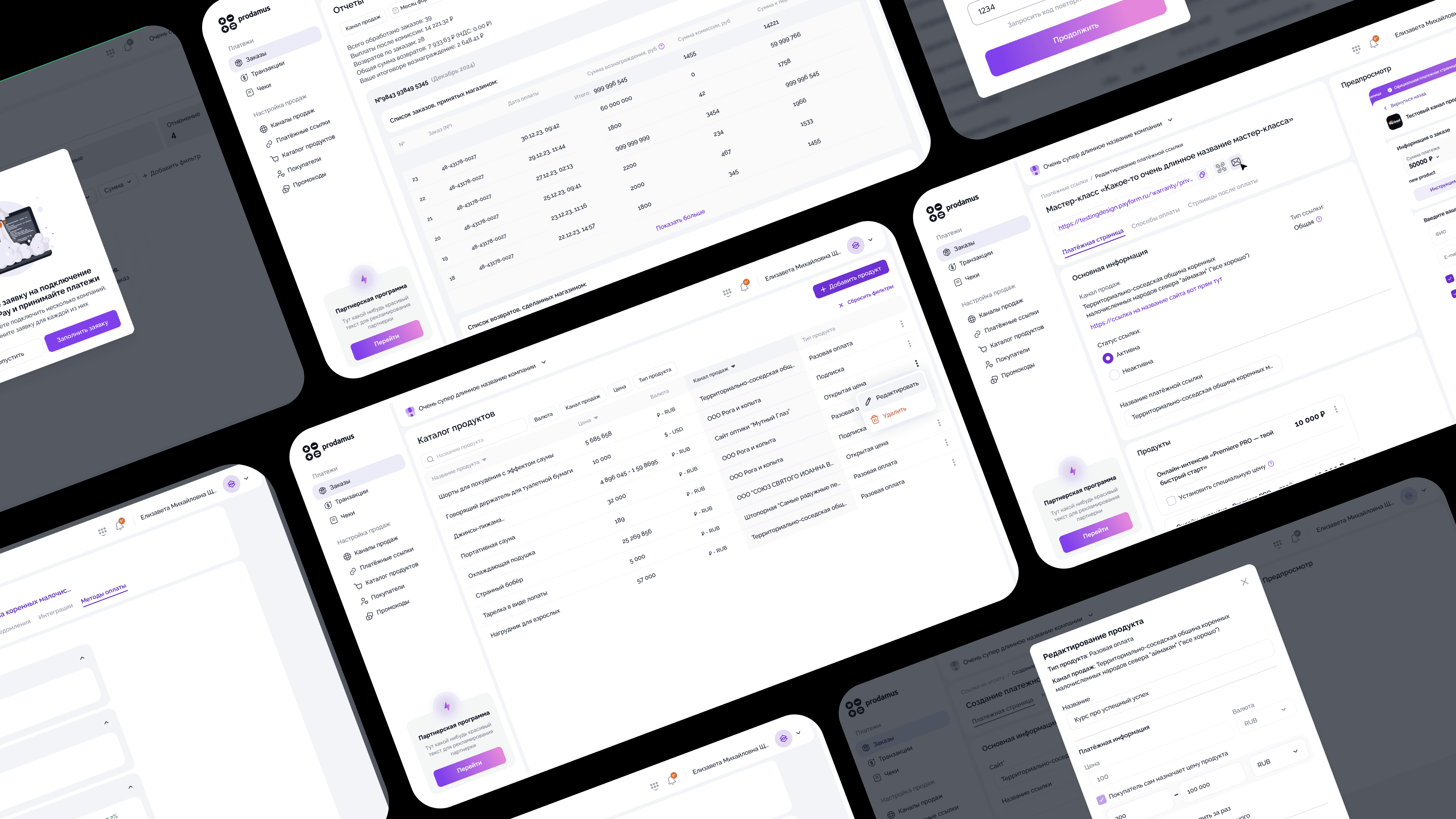
The first version of the Merchant Platform was functional but limited — built fast to support the initial launch.
When it became clear that growth required a full redesign, I joined the team to lead the transition to version 2.0.
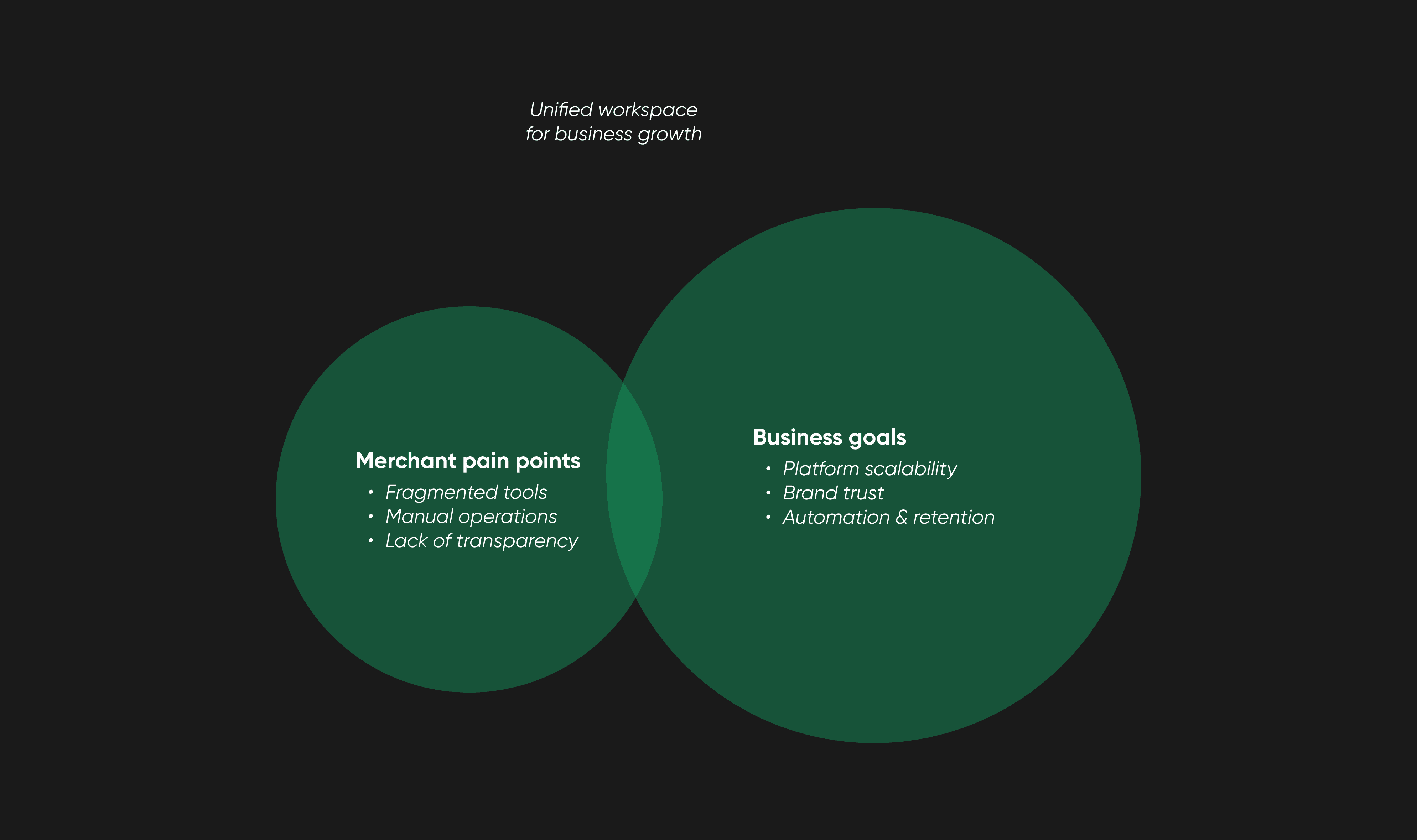
Business Goal
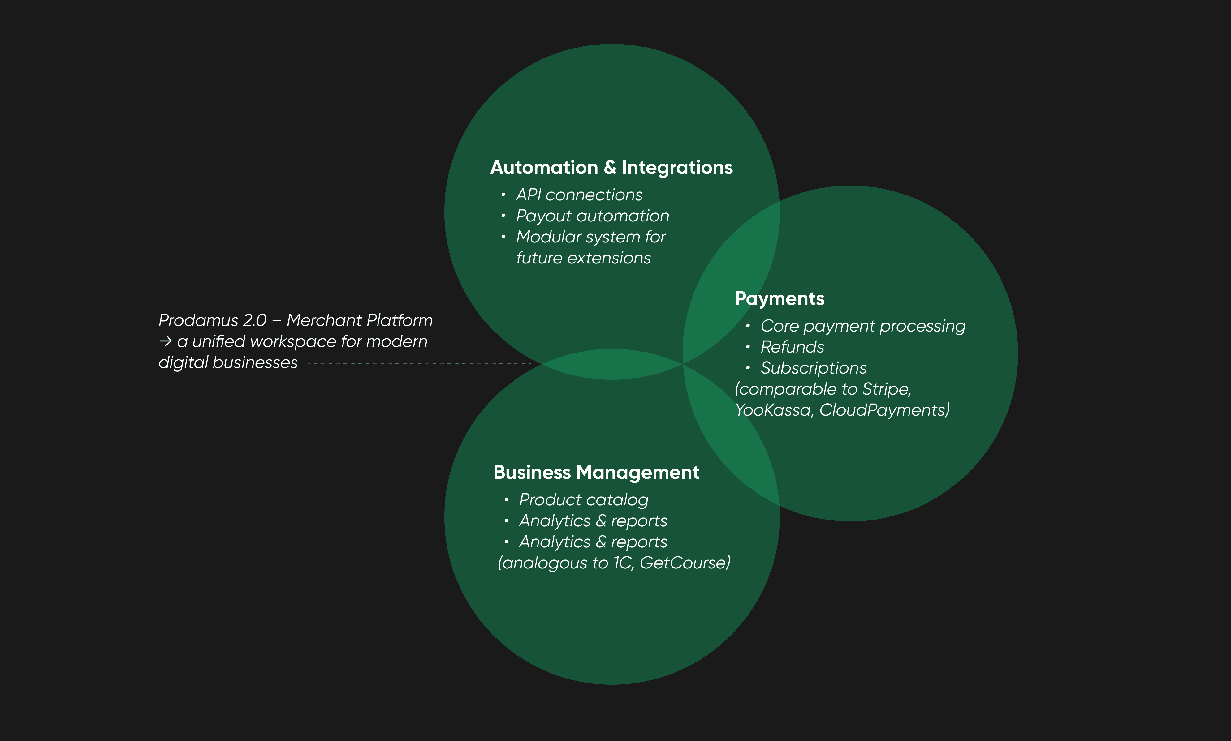
The goal was to turn the Merchant Platform into a reliable workspace — not just a place to view data, but a hub for managing every part of a merchant’s business.
The new version needed to simplify navigation, unify visuals, and make complex actions — like tracking payments or analyzing sales — feel effortless and intuitive.
It also had to stay flexible and scalable enough to support new product modules and third-party integrations in the future.
Product Hunch
Ideally, we’d start with solid user research and structured analytics — interviews, funnel data, behavioral patterns, usage cohorts.
But at that stage, the Merchant Platform didn’t have a mature research setup or reliable instrumentation.
Most insights were scattered across support tickets, chat logs, and spontaneous feedback from merchants.
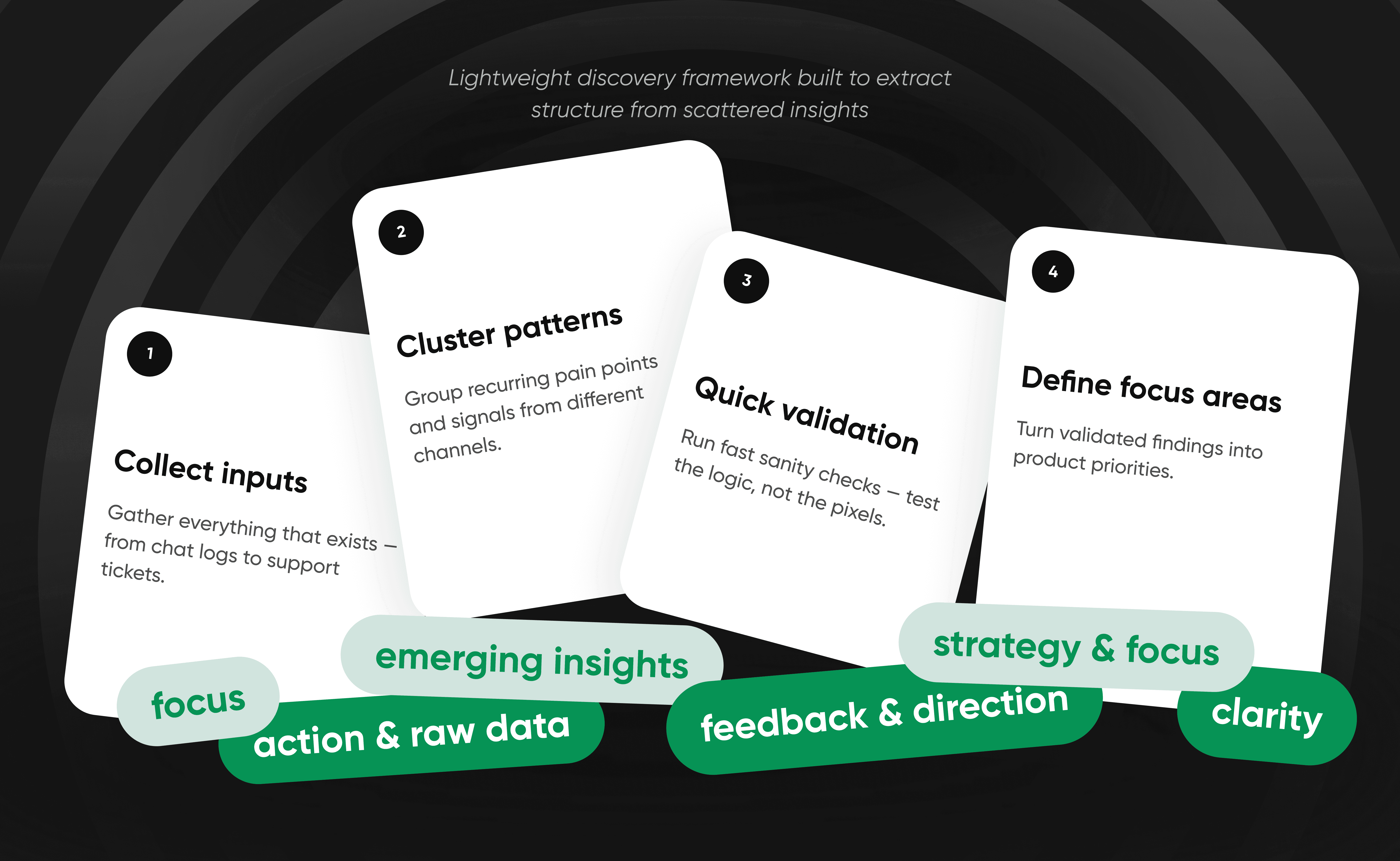
To make progress, we started with what we already had:
✦ Analyzed support tickets and user messages to identify recurring issues.
✦ Reviewed feedback from sales and account teams to uncover business-critical pain points.
✦ Conducted short merchant interviews to validate early assumptions.
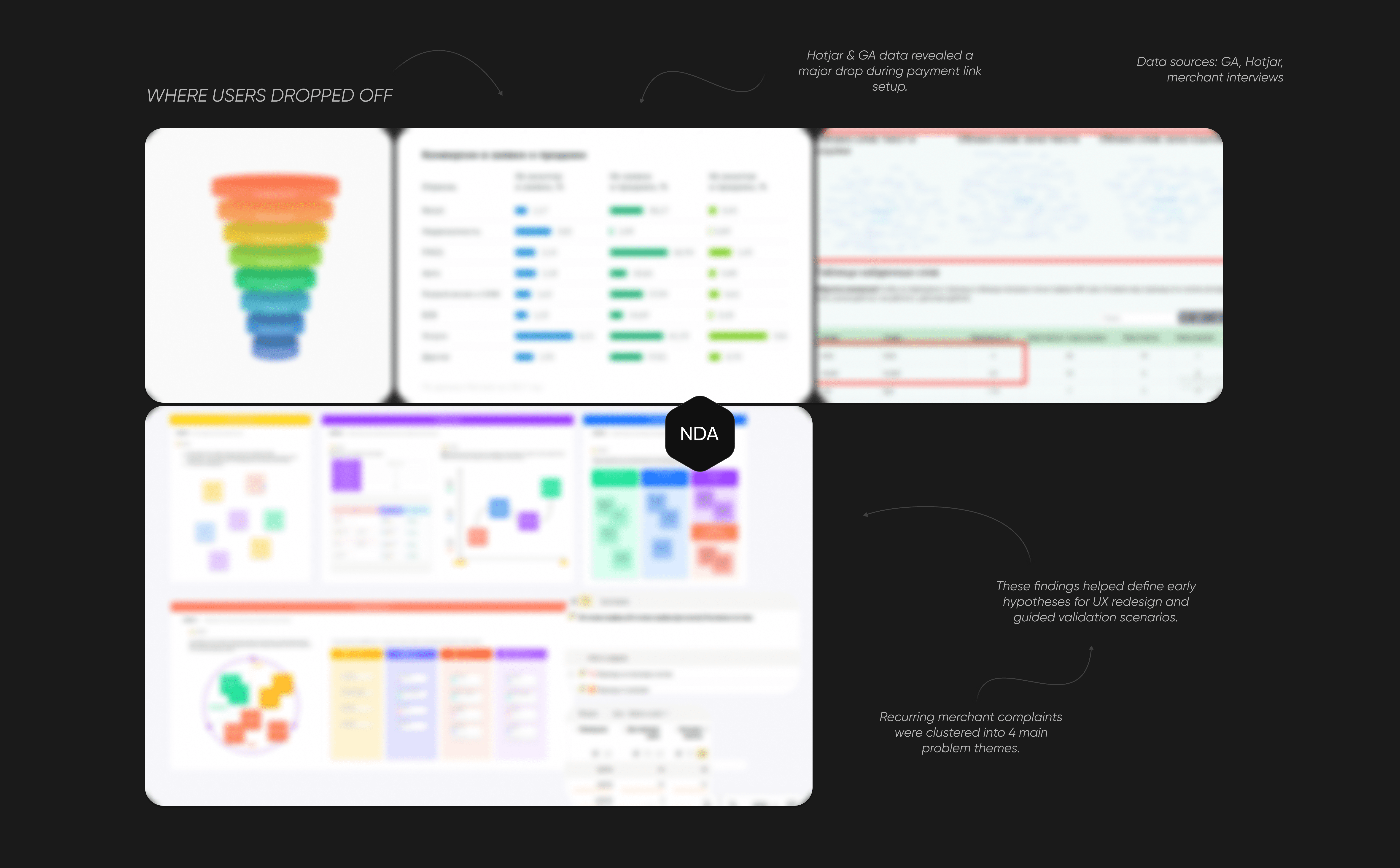
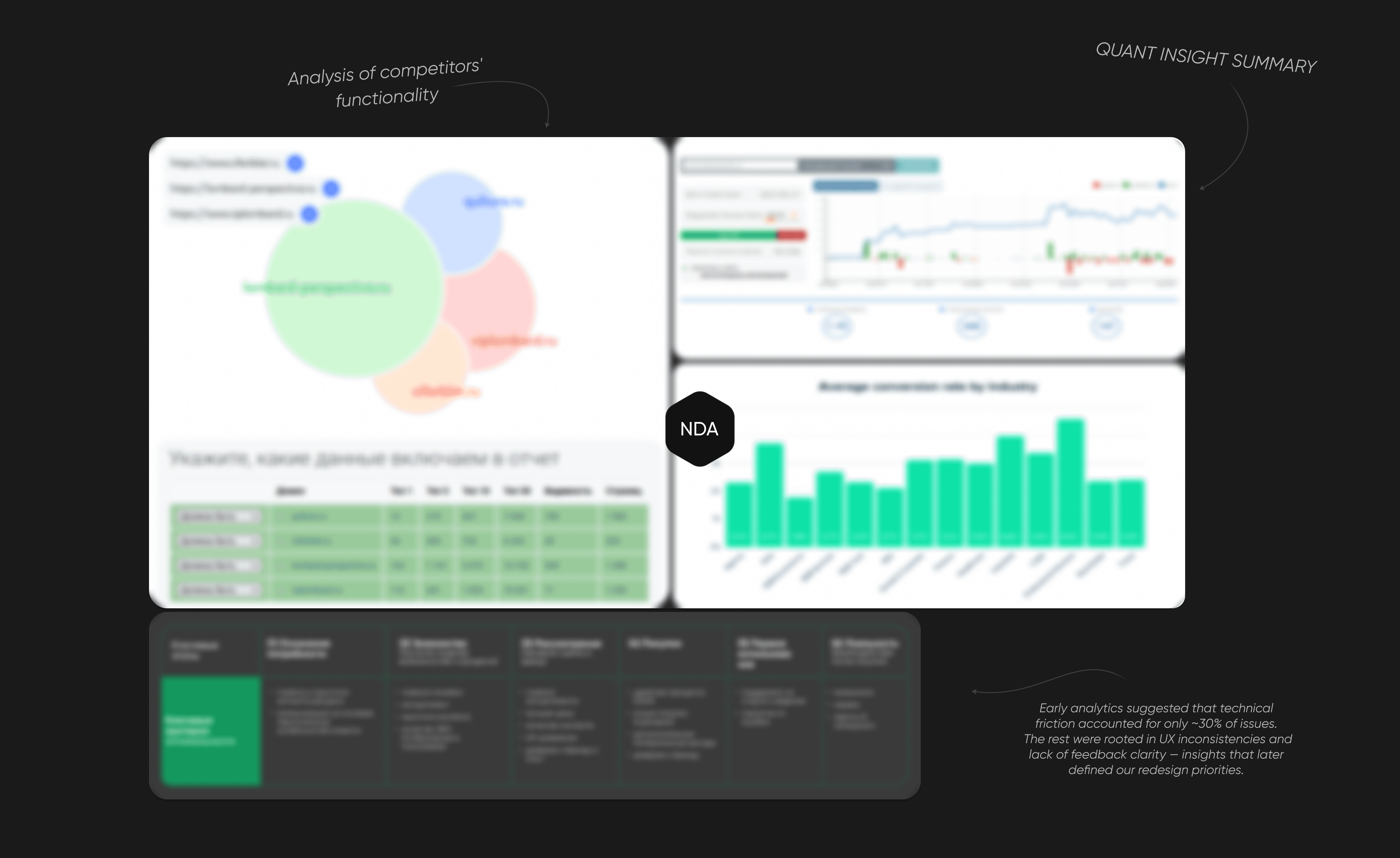
✦ Checked Google Analytics and Hotjar to see where merchants dropped off or got stuck.
Some patterns were predictable — navigation issues, unclear states, scattered data. But the deeper we looked, the more inconsistencies appeared — hinting that the problems went beyond UX.
Understanding the Opportunity
As we started connecting data and feedback, the bigger picture became clearer.
✦ Larger merchants were juggling multiple systems — Excel, 1C, and Prodamus — just to reconcile sales and payouts.
✦ Refunds could only be processed through tech support, creating long manual loops.
✦ Merchants with several companies needed separate accounts and had to constantly switch between them.
✦ Product-level sales data didn’t exist at all — every payment link was just a line in a stream of transactions.
At first, we assumed the main issue was interface complexity.
But we soon realized it wasn’t only a design problem — it was missing structure, transparency, and trust. Some features had never been used, while essential ones lived outside the platform. Even onboarding data told the same story: merchants were willing to invest time registering, but they churned the moment they saw what waited inside.
This revealed a bigger opportunity — Prodamus wasn’t just competing on UX. It was competing on reliability and perception in a rapidly shifting fintech landscape, where merchants valued trust and clarity over feature count.
The potential was clear: if the Merchant Platform could become a single reliable workspace — unifying payments, analytics, and automation — it would not only improve retention, but position Prodamus as a long-term partner rather than just a payment processor.
“The real issue wasn’t missing features, but the missing sense of reliability. Merchants didn’t feel the platform worked for them — they felt they were working around it.”
Informing the Opportunity
After connecting qualitative insights with behavioral data, we were able to segment our merchants and understand where the biggest opportunities — and risks — actually were.
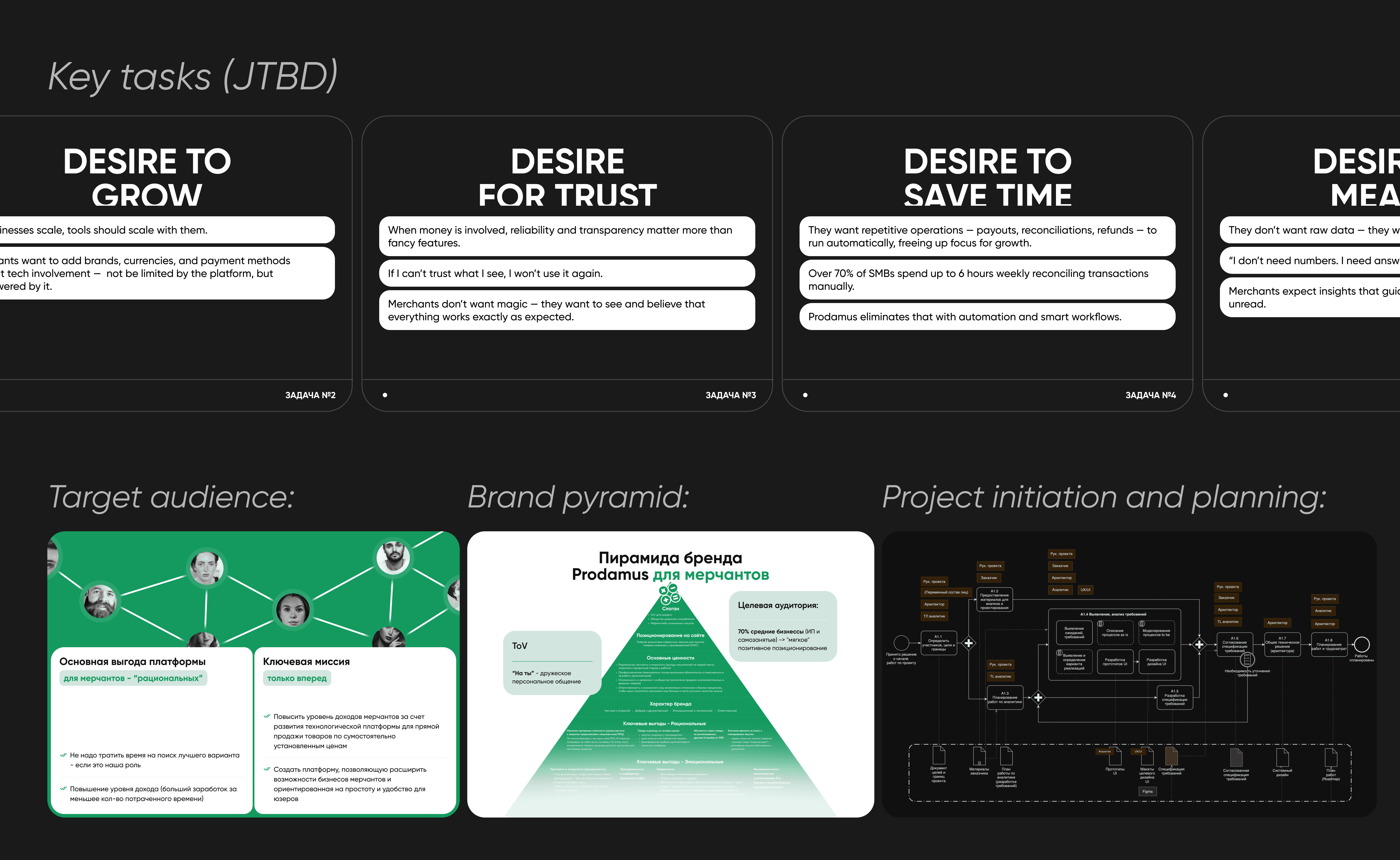
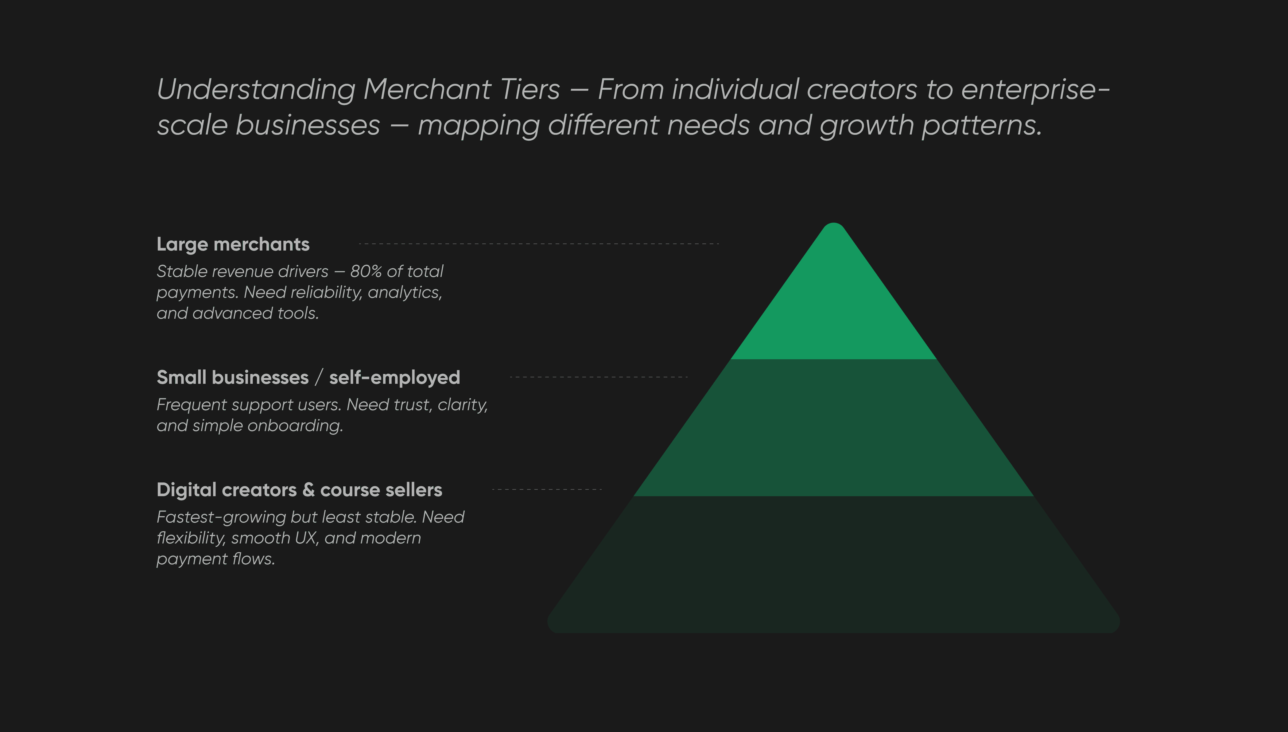
The audience split naturally into three groups:
✦ Large merchants (established businesses, agencies, major influencers) — handled nearly 80% of total payments. They were loyal but demanded stability and advanced tools for managing scale.
✦ Small businesses and self-employed merchants — wrote to support most frequently, struggling with confidence and product transparency.
✦ Digital creators and course sellers — the fastest-growing segment, but also the quickest to churn. They expected smoother flows, flexible customization, and a more modern UX.
We found that many top merchants used multiple platforms — Excel, 1C, GetCourse, and Prodamus — to reconcile sales, payouts, and refunds. They compared us directly with YooKassa, CloudPayments, and Stripe — noting simpler onboarding, faster integrations, and cleaner reporting in those systems. For digital businesses, that difference often became a dealbreaker.
At the same time, several key opportunities emerged — improving multi-account access, simplifying product catalog management, and automating payouts.
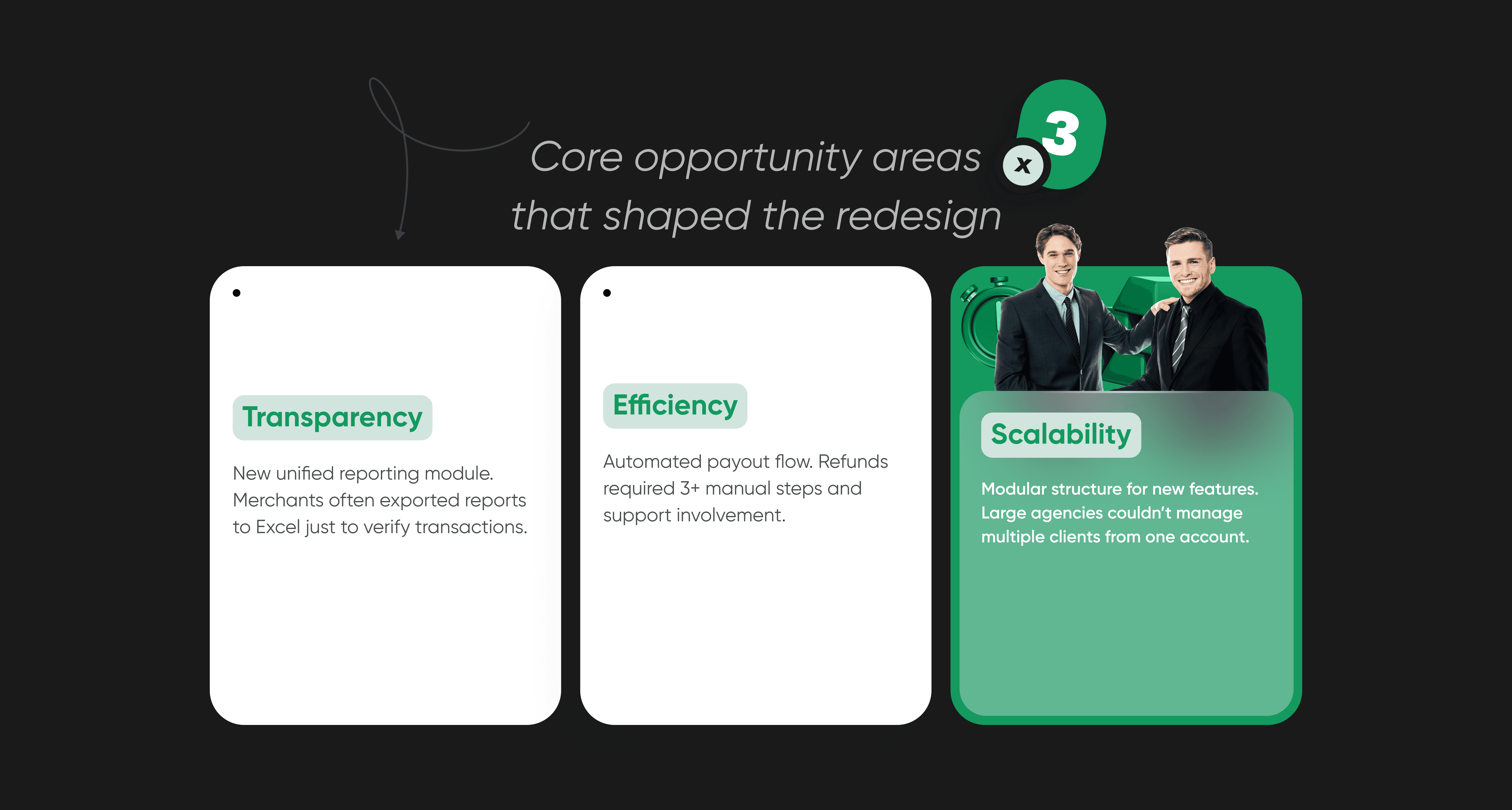
All of them mapped neatly into three broader directions we decided to focus on:
✦ Transparency — unify data and reporting.
✦ Efficiency — reduce manual operations.
✦ Scalability — prepare the product for future integrations and modules.
These findings shaped how we defined the next stage of the redesign — from building prettier screens to creating a system merchants could actually trust and grow with.
Expanding the Opportunity
Our research revealed that the platform’s growth potential extended far beyond its original scope.
While the existing product focused on payment processing, the broader merchant ecosystem — especially digital entrepreneurs — was expanding fast and demanded more connected, integrated tools.
We identified three major opportunity areas:
✦ Business management, not just payments.
Merchants wanted to treat Prodamus as a control center rather than a transaction tool. They needed clear visibility into products, revenue, refunds, and customer activity — all in one place.
✦ Automation and efficiency.
Manual refund flows and constant account switching were wasting hours each week. Automating these processes could drastically improve retention and reduce support load.
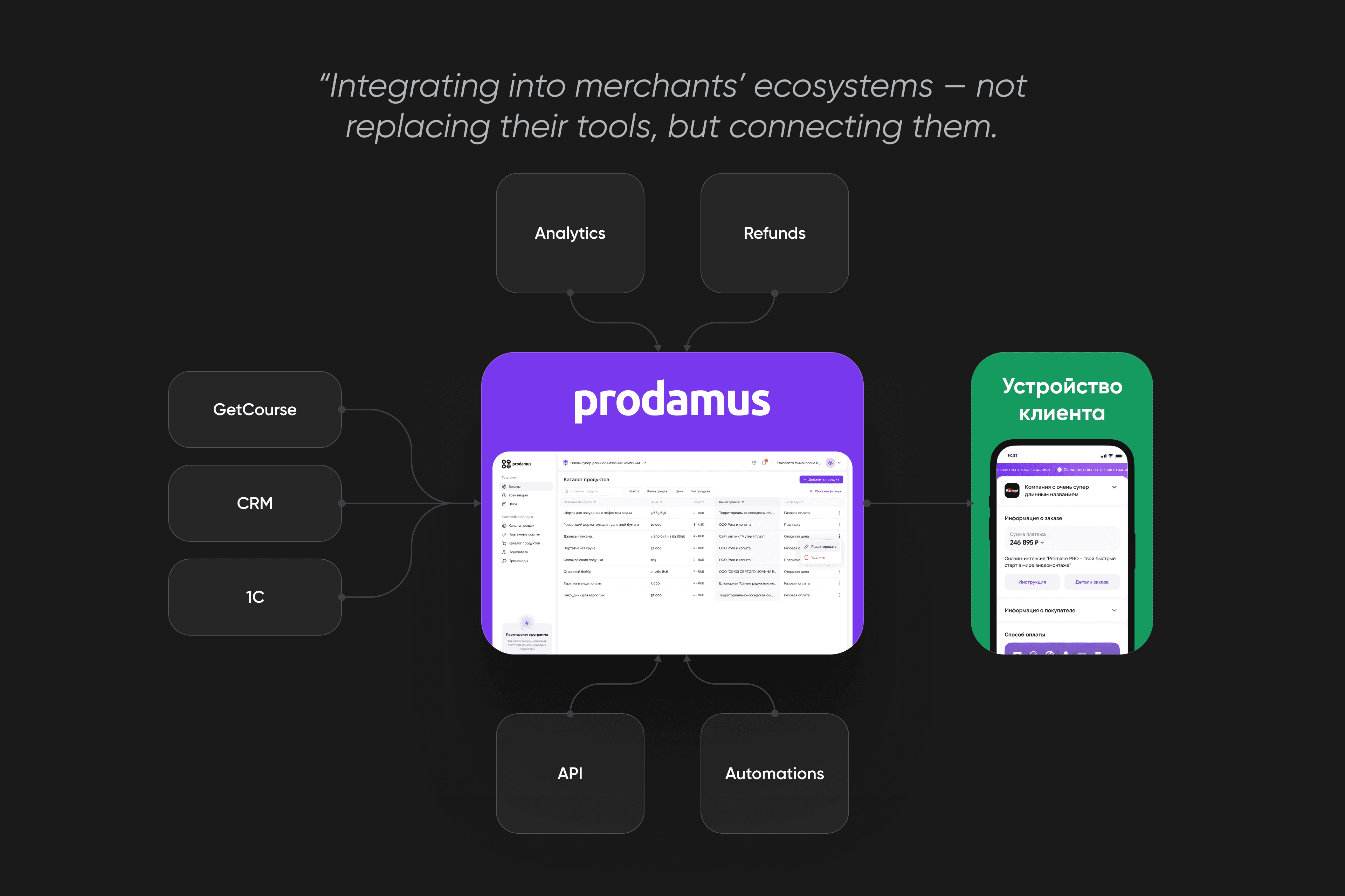
✦ Scalability and ecosystem growth.
Larger merchants were already using Prodamus alongside 1C, GetCourse, and CRM tools. Offering integrations and API access would turn Prodamus into the backbone of their operations — not just another service in the chain.
Shaping the Vision
The first version of the Merchant Platform worked — but barely.
Even small updates required developer help, and simple actions felt slow and clunky.
Version 2.0 wasn’t just a redesign — it was a complete rethink.
The goal was to make Prodamus a workspace that adapts to merchants of any size and grows with them.
To make that happen, we focused on three design principles:
✦ Clarity — intuitive navigation and a cleaner information structure.
✦ Consistency — unified visual and interaction patterns across the platform.
✦ Scalability — modular design system ready for future product growth.
The redesign shifted Prodamus from a payment tool to a platform merchants could actually rely on — not just to process payments, but to run their business.
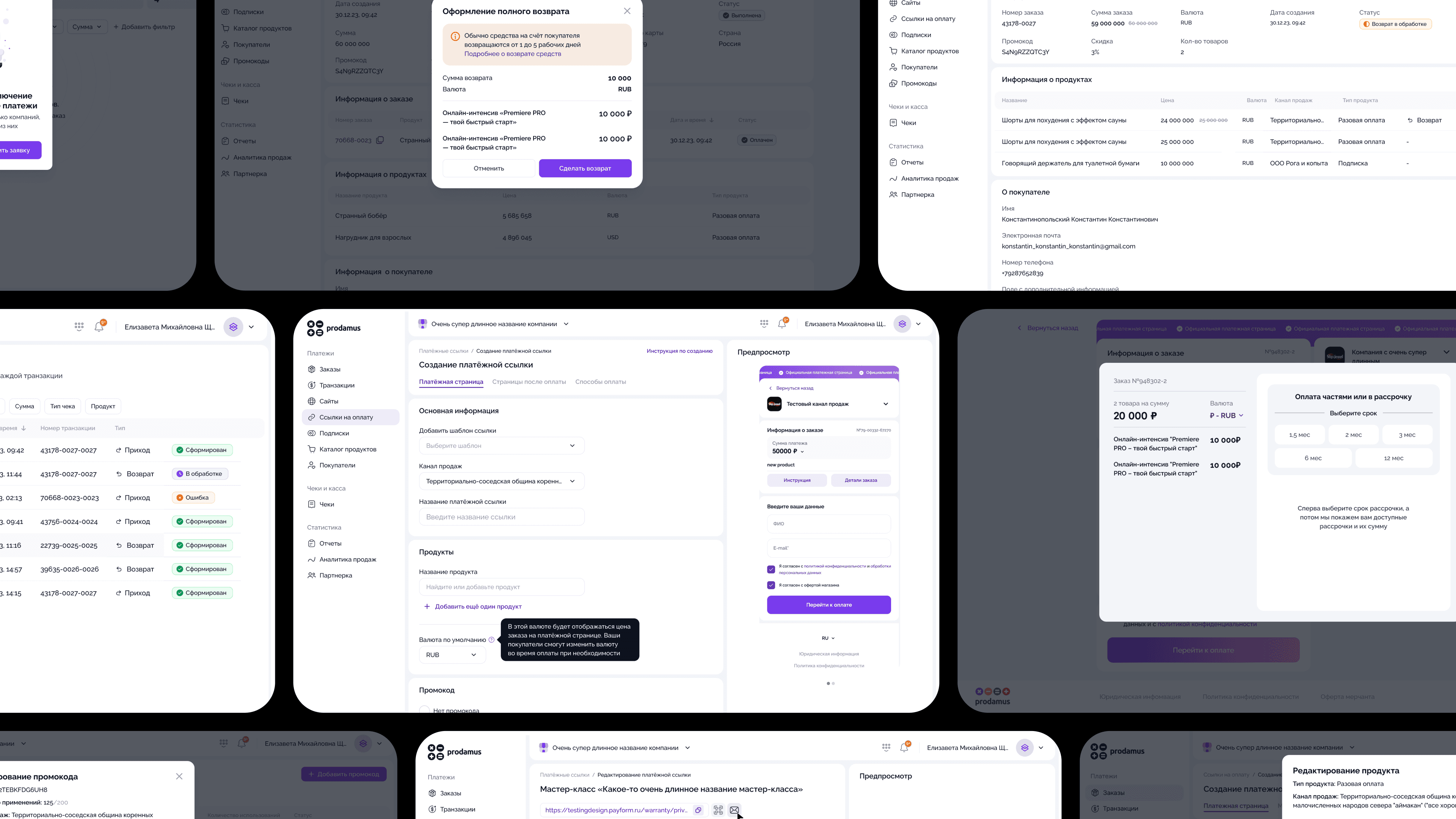
Pillar I — Transparency & Control
Merchants needed visibility — not just transactions. We redesigned the data structure and lists to make payment, order, and refund information clear and traceable.
New filtering and API integration options let merchants sync their data with external tools like CRMs and accounting systems.
Analytics and reports weren’t part of the first release yet, but the groundwork was laid — ready for detailed dashboards and sales metrics in the next phase.
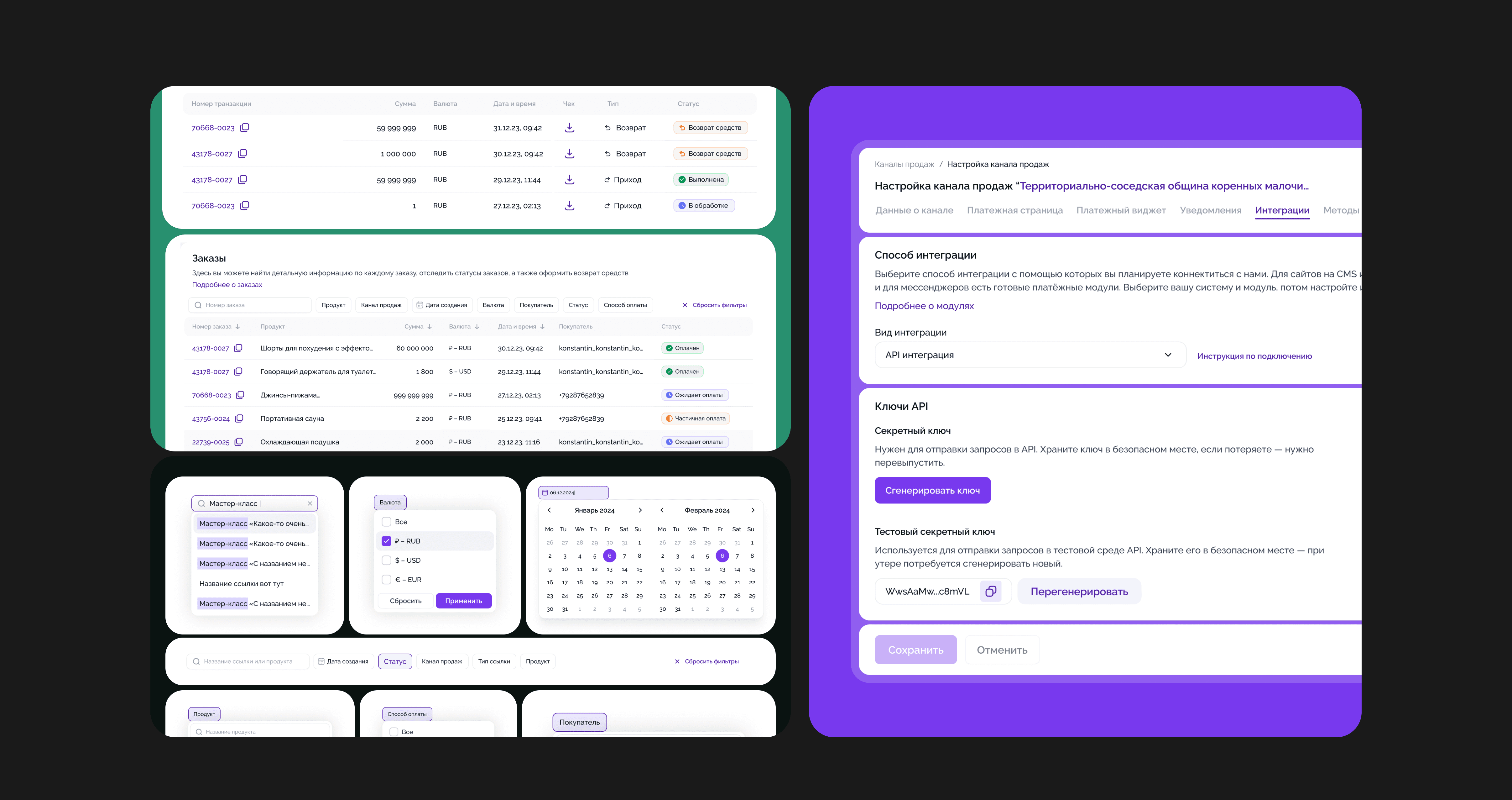
Pillar II — Efficiency & Flow
The new platform focused on removing friction from daily operations.
Refunds became automated (with partial returns supported), multi-account management was introduced, and the system was rebuilt to support company sub-accounts in future updates.
Merchants also gained access to more payment options — including new banks and installment services.
We simplified onboarding by shortening the registration form, automating withdrawals and monthly reports, and adding exports for orders and transactions.
Finally, the new navigation and filtering system made moving between sections intuitive and fast — even for large-scale merchants.
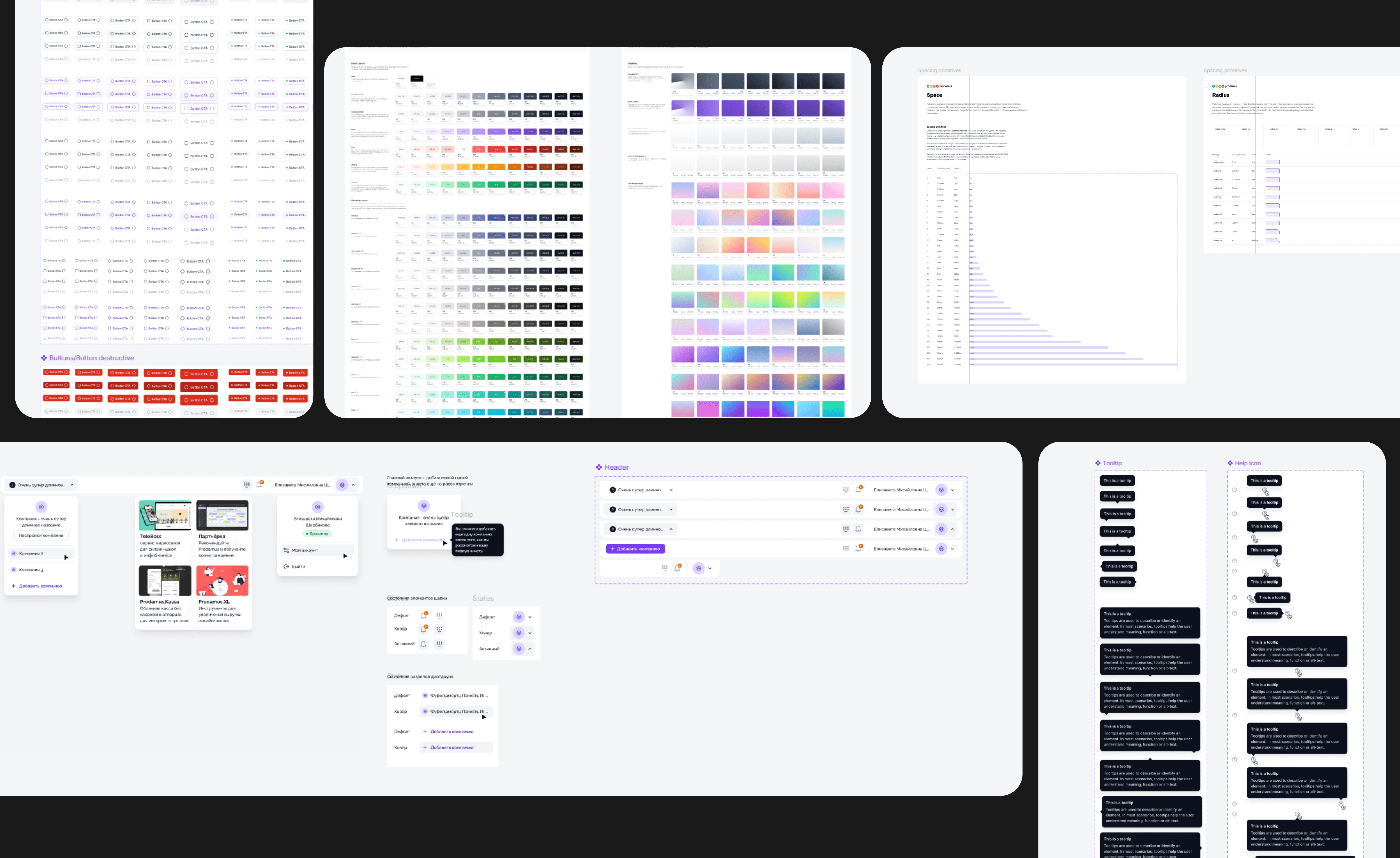
Pillar III — Scalability & Consistency
The 2.0 platform was built to last. We designed a complete design system from scratch — defining components, states, typography, spacing, colors, and radii — and aligned it one-to-one with front-end implementation to eliminate friction between design and development.
Every visual element was redefined for consistency.
The unified spacing system and modular component structure now allow any section or feature to evolve both visually and logically without breaking alignment or code.
Together, these pillars became the backbone of Merchant Platform 2.0 — a product built to simplify operations, scale with growth, and free merchants from support chaos.
How did we get there?
Once the new vision was defined, the challenge was to make it real — without breaking what already worked. We rebuilt the platform architecture, fixed the UX foundation, and delivered visible improvements fast enough to keep merchants engaged.
✦ We set up a cross-functional core team — product, design, analytics, architecture, and tech support. Everyone owned a piece of the puzzle: from mapping user pain points to ensuring the backend could scale with the new logic.
✦ Research and validation went hand-in-hand with design. We reviewed hundreds of support tickets and sessions, identified recurring friction points, and tested early prototypes with merchants. Some findings challenged our assumptions — what looked like a “UI issue” often turned out to be a workflow or policy limitation.
✦ Architecture and scalability work ran in parallel. I collaborated closely with the system architect to align the data model, API logic, and user journey structure. That allowed us to simplify flows like refunds, transactions, and payouts — while keeping the system stable for live users.
✦ Design system became the backbone. We built modular components in sync with developers, ensuring design parity between Figma and code. This cut delivery time, improved visual consistency, and made future iterations drastically faster.
✦ Compliance and security stayed integral. We worked with the internal security officer to ensure new flows met all payment and data protection standards — especially around refunds and account switching.
After shaping the foundation, we presented the new platform vision to the CEO and board. The redesign became part of the broader fintech strategy — shifting Prodamus from a payment processor to a merchant growth ecosystem.
With full executive buy-in, multiple workstreams launched in parallel — from system architecture and analytics to product design and onboarding improvements. Each iteration was research-informed, validated with merchants, and aligned with the long-term scalability roadmap.
Summary
The redesign of the Merchant Platform transformed Prodamus from a payment tool into a scalable ecosystem for digital businesses. It brought structure to chaos, automated repetitive operations, and laid a foundation for future modules like analytics, product catalogs, and team accounts.
After launch, the impact was immediate — merchant activation improved, support load decreased, and internal teams began reusing the new design system across other company products.
But beyond metrics, the shift was cultural — merchants finally felt the platform was working with them — not against them.
Reflections
Big redesigns rarely fail because of design — they fail because of silence. Keeping leadership, devs, and business in one loop from day one kept the process grounded and collaborative.
And limited resources — paradoxically — helped us stay focused on the right users, real problems, and progress that actually ships.